Frame
The system was being asked to do something it wasn't built for.
Three brands. Two of them in simultaneous redesign. Two parent product systems also restructuring beneath them. 4.5 million component and token insertions this year, 70+ distinct Figma teams pulling from the system every day, building marketing pages and product experiences against a foundation that was quietly buckling under the load.
V5 had to quickly mature into v6 and undergo a migration from variant-based theming to mode-based architecture, a rebuild of the color theme structure, and the introduction of a new collection that would absorb the brand change v5 couldn't.
The Problem
Two structural pains.
The system couldn't scale across brands without compounding cost. Every brand added to v5 multiplied configuration complexity. Variable modes carried brand and viewport combinations in the same axis. Color theme and viewport size were implemented as variant properties on the components themselves, so every brand × theme × breakpoint combination produced its own variant. A new brand meant new modes, new variants, new tokens, new everything across the whole library.
The system couldn't stay aligned with its parent product systems. Venmo.com inherits brand identity and foundational structure from the Venmo app's design system (VDS). PayPal.com inherits from the PayPal app's design system (PDS). v5 held all three brands' primitives in one shared collection, meaning whenever a parent system updated, syncing required surgical edits across a structure that wasn't designed to isolate the work. A parent brand redesign was a multi-week cleanup operation.
Files ran heavy. The variant explosion driven by the theme-as-variant approach pushed library files into performance territory that affected every consuming team. Existing theme structure often forced external users to reach outside the system for stronger brand expression. That broke color and typography patterns and cut them off from future system improvements. Variable mode mismatches happened constantly (applying PayPal brand mode, but a Venmo responsive mode to a component), producing inaccurate brand rendering that was hard to debug because the failure mode was silent.
Underneath the architectural problems were operational ones. v5 had two of the three structural pieces v6 would eventually need: a Color Plate collection and a Responsive collection, but almost no one outside the system team used them. Most consuming designers had never touched variable modes in Figma. The technical capacity for mode-based work was sitting there, unused.
All of this came to a head as Venmo and PayPal went through simultaneous brand redesigns, while VDS and PDS were going through their own restructures. Four upstream sources of brand and architectural change, all moving at once, against a v5 architecture that was never built to hold it.
The Approach
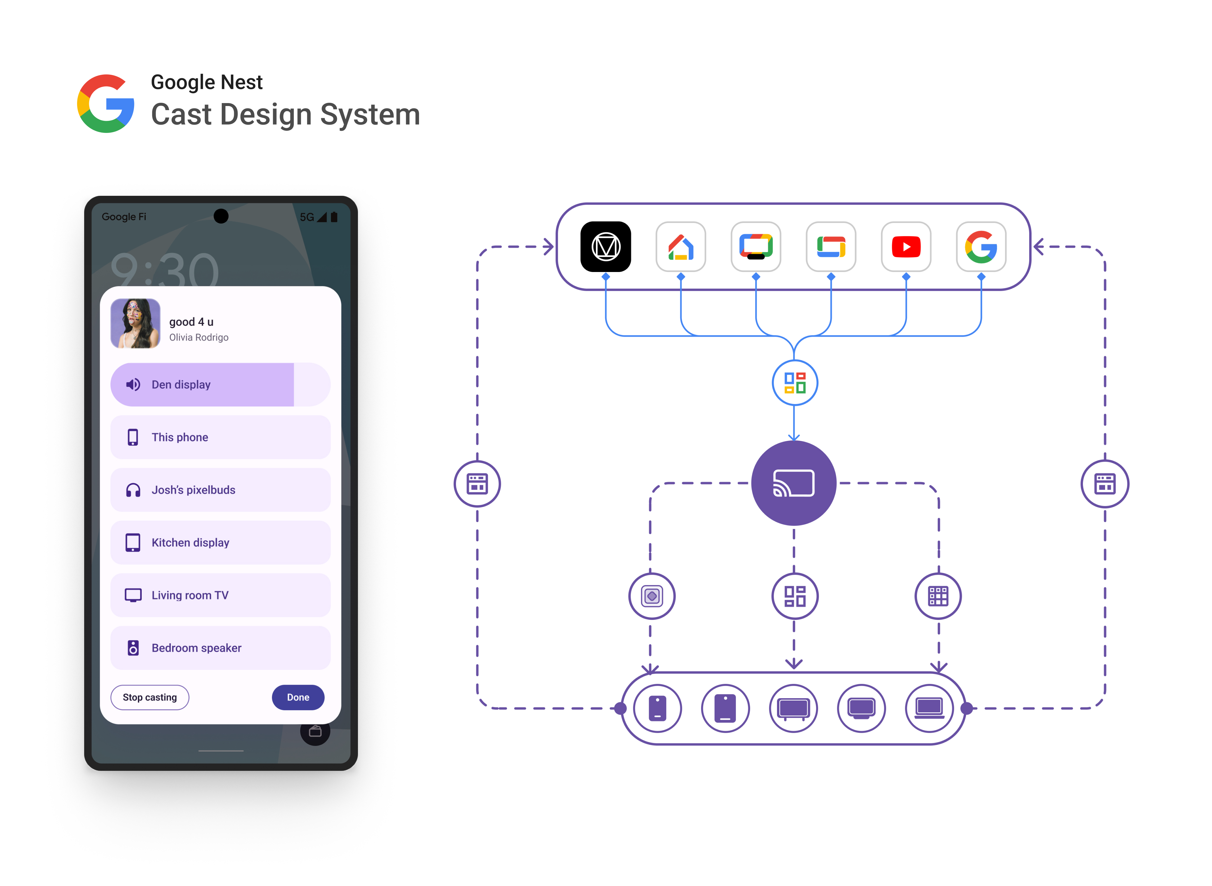
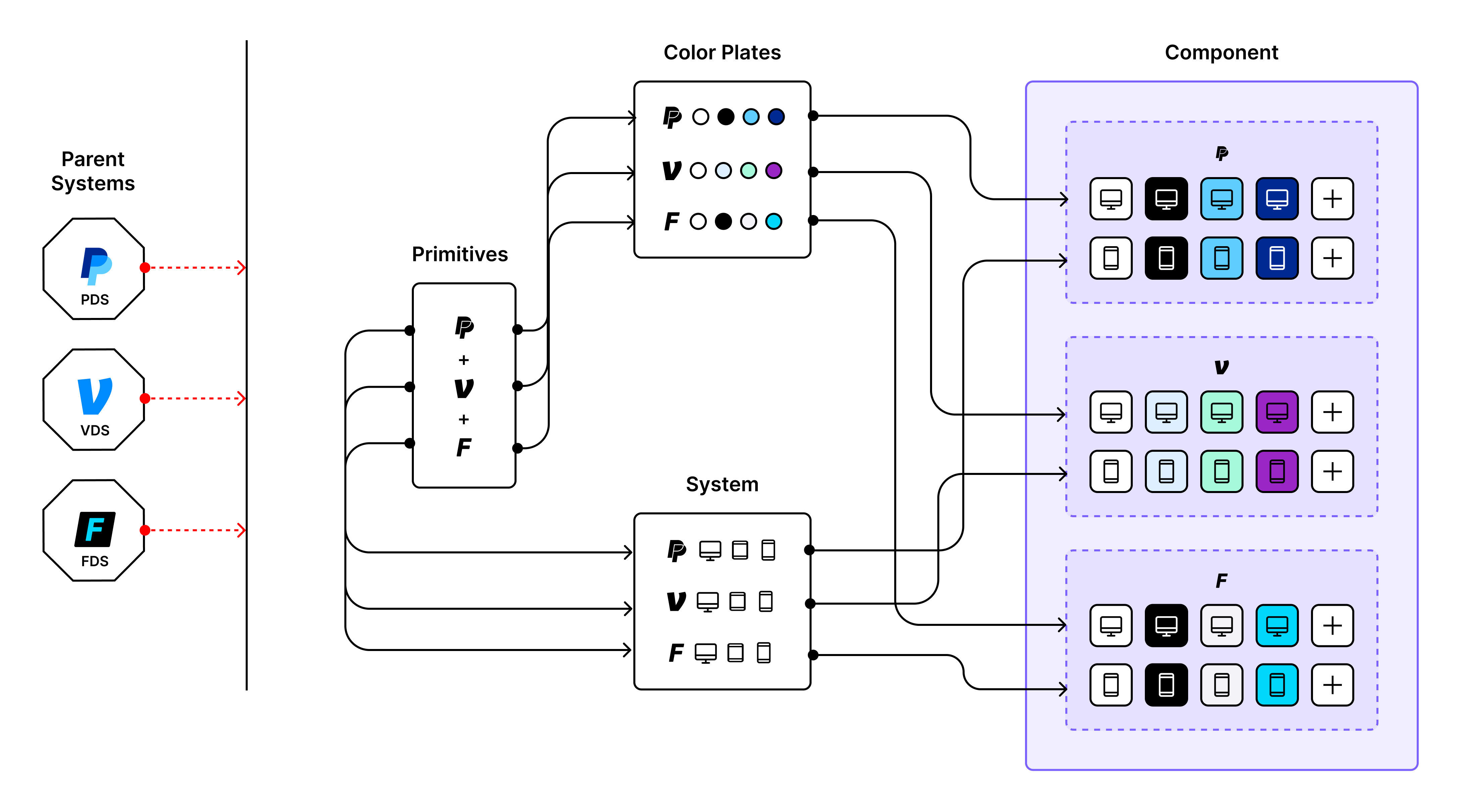
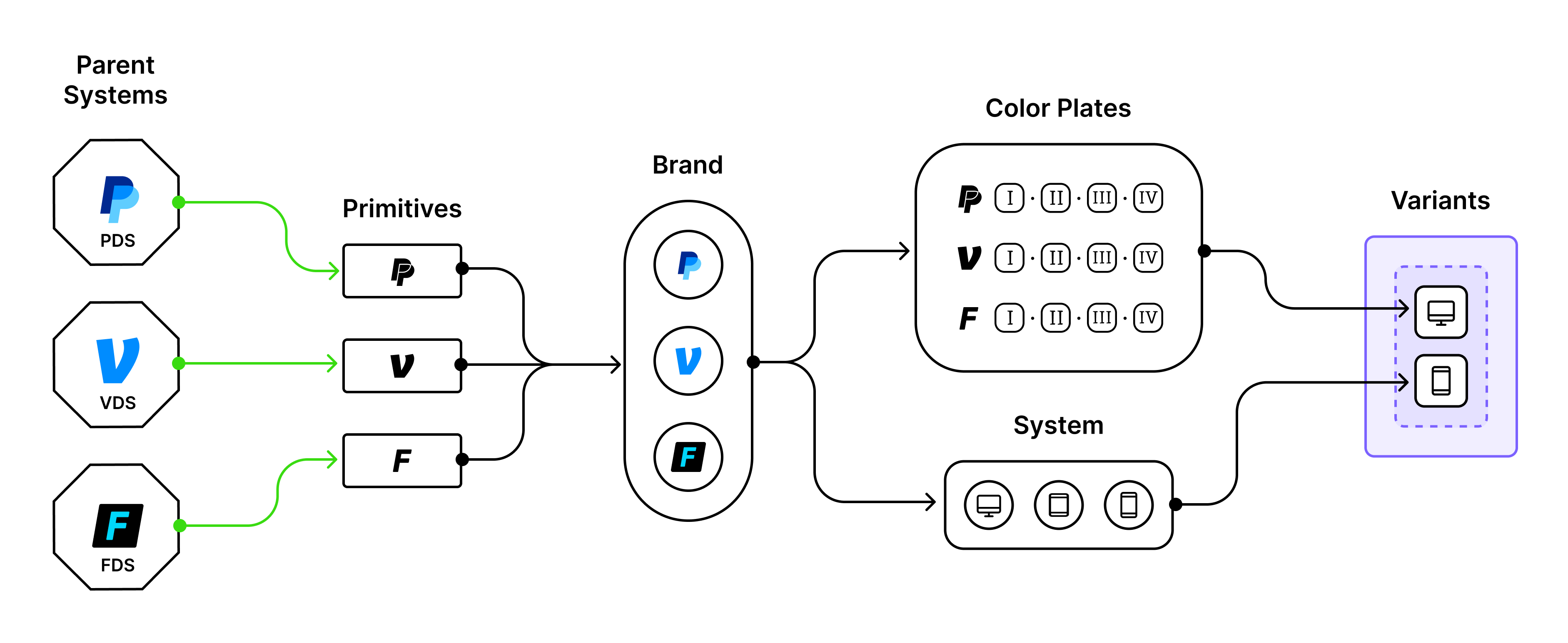
The architectural move was to introduce a layer that didn't exist in v5: a brand collection that would sit between parent primitives and the consuming layers, acting as a stable contract that absorbs brand change rather than propagating it downward.
This move would resolve the brand sync pain described above. Parent primitives would feed into the brand collection to define its semantic role tokens. Consuming layers would only need to pull from this collection. When PDS or VDS shipped a change, only the brand layer would update; the layers below would see no structural change. The same architecture would work in reverse for new brands: add a brand mode, map new primitives, feed consuming layers.
A key constraint shaped the process: we had to keep engineering and authoring overhead to a minimum. Existing component token usage had to be preserved. The brand collection had to solve for multi-brand within the existing structure of our semantic collections. This meant that the structure of brand itself had to offer strong and flexible role pairing patterns.
To support the brand collection at scale, v5's shared reference layer would also need to be replaced by a set of individual primitives collections, cloned from each brand's parent system (PDS / VDS / FDS).
We adapted and expanded on PDS's token role pairing techniques to strengthen our multi-brand and alignment efforts. Applying them consistently across the full role taxonomy would reinforce scalability and consistency of design decisions. Visual coherence enforced through structure, not just review cycles.
The orchestration brand layer would also enable a downstream architectural move that v5 had blocked: removing the theme variant property and using variable modes to drive color theme configuration. The variant explosion that had been driving file bloat would compress into mode-level control.
To keep the mode system scalable, v5's primitive-based naming convention (White/Black/Blue 300) would need to change to a semantic one (Primary/Secondary/Tertiary). The payoff for moving to fully semantic naming was structural: if system brands changed or added core colors, the color plate taxonomy and architecture wouldn't need to change. Primary stays primary. The plate names stay honest.
With Venmo's rebrand came an opportunity for a wider range of visual expression. Marketing stakeholder buy-in inspired an expanded color theme set from the new brand identity's 15 core color ramps. Candidate colors went through exploration rounds, component-matrix testing, and page-level validation.
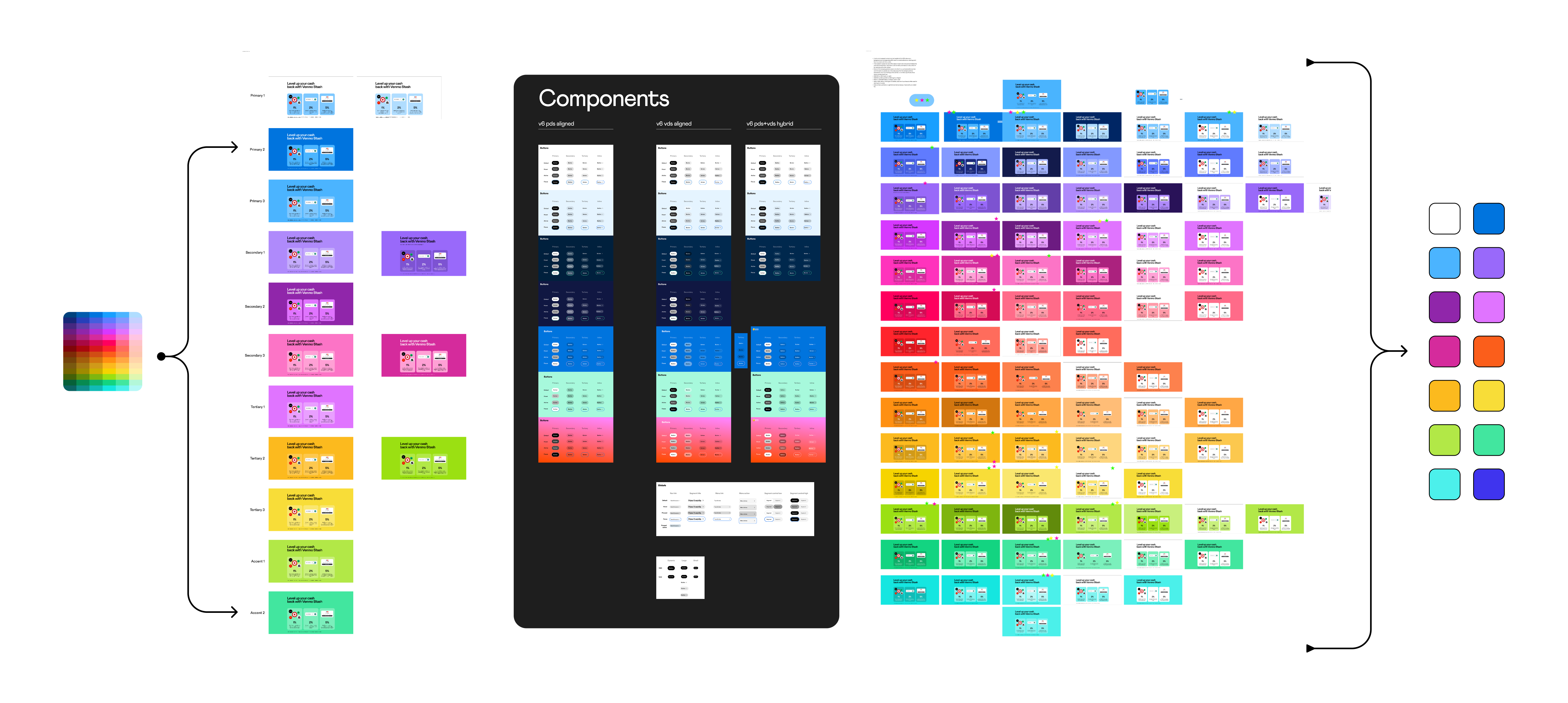
Adoption and alignment decisions were evaluated against three changing reference systems (PayPal.com within our system; VDS upstream; PDS upstream). Aligned with VDS where brand identity had to flow non-negotiably, and with PayPal.com where the shared path served Venmo. Diverged with new patterns where marketing-driven needs required structural moves neither parent supported. Not a blended hybrid, but an area-by-area decision pattern.